Our Editorial Work
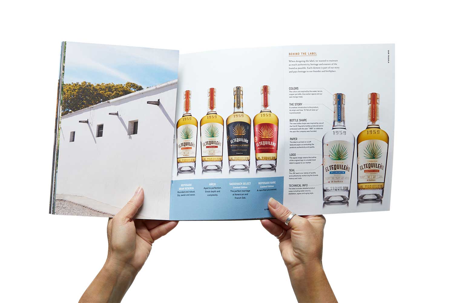
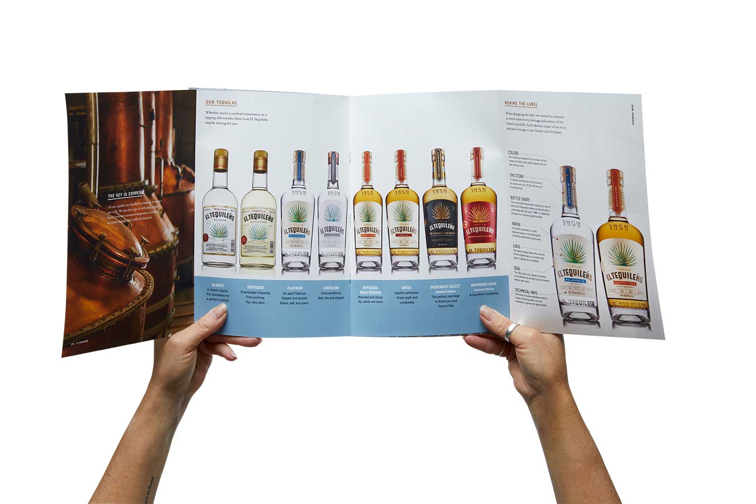
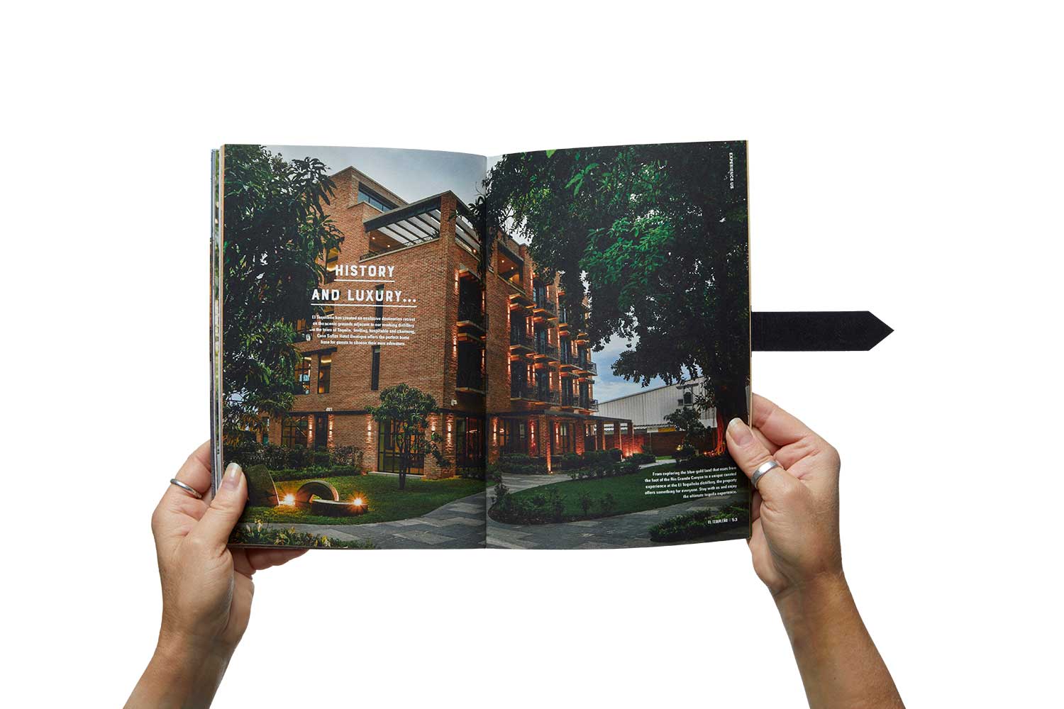
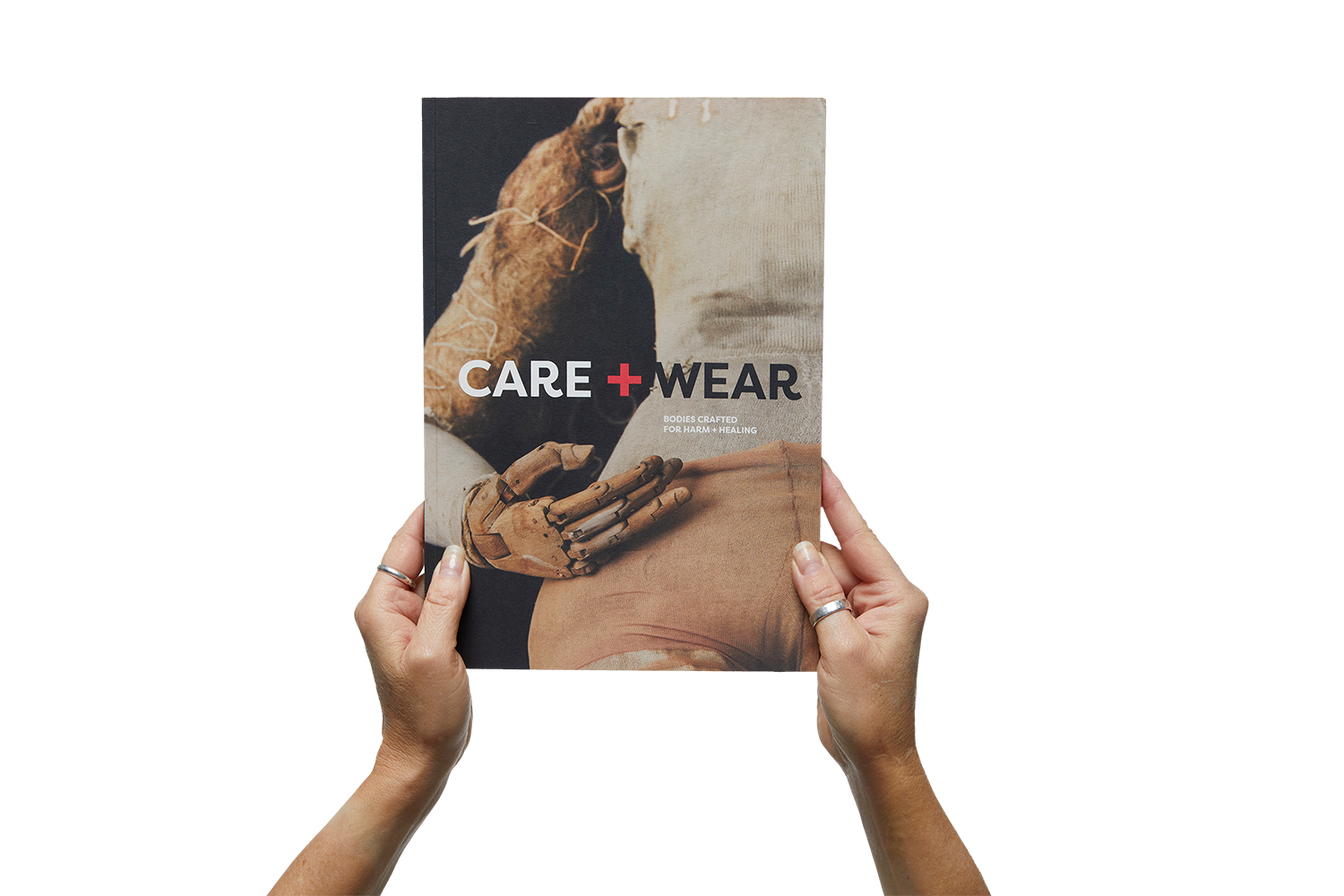
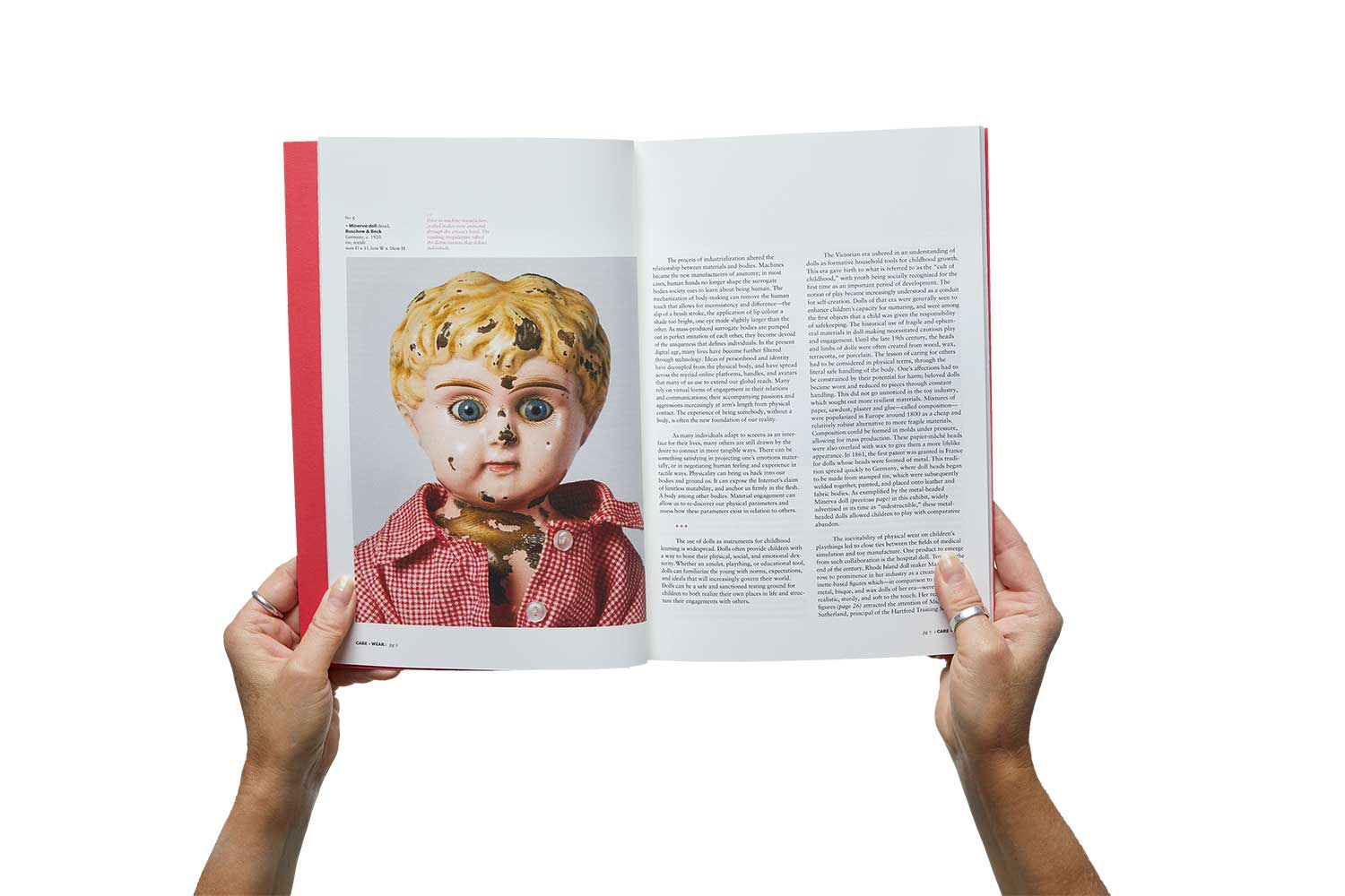
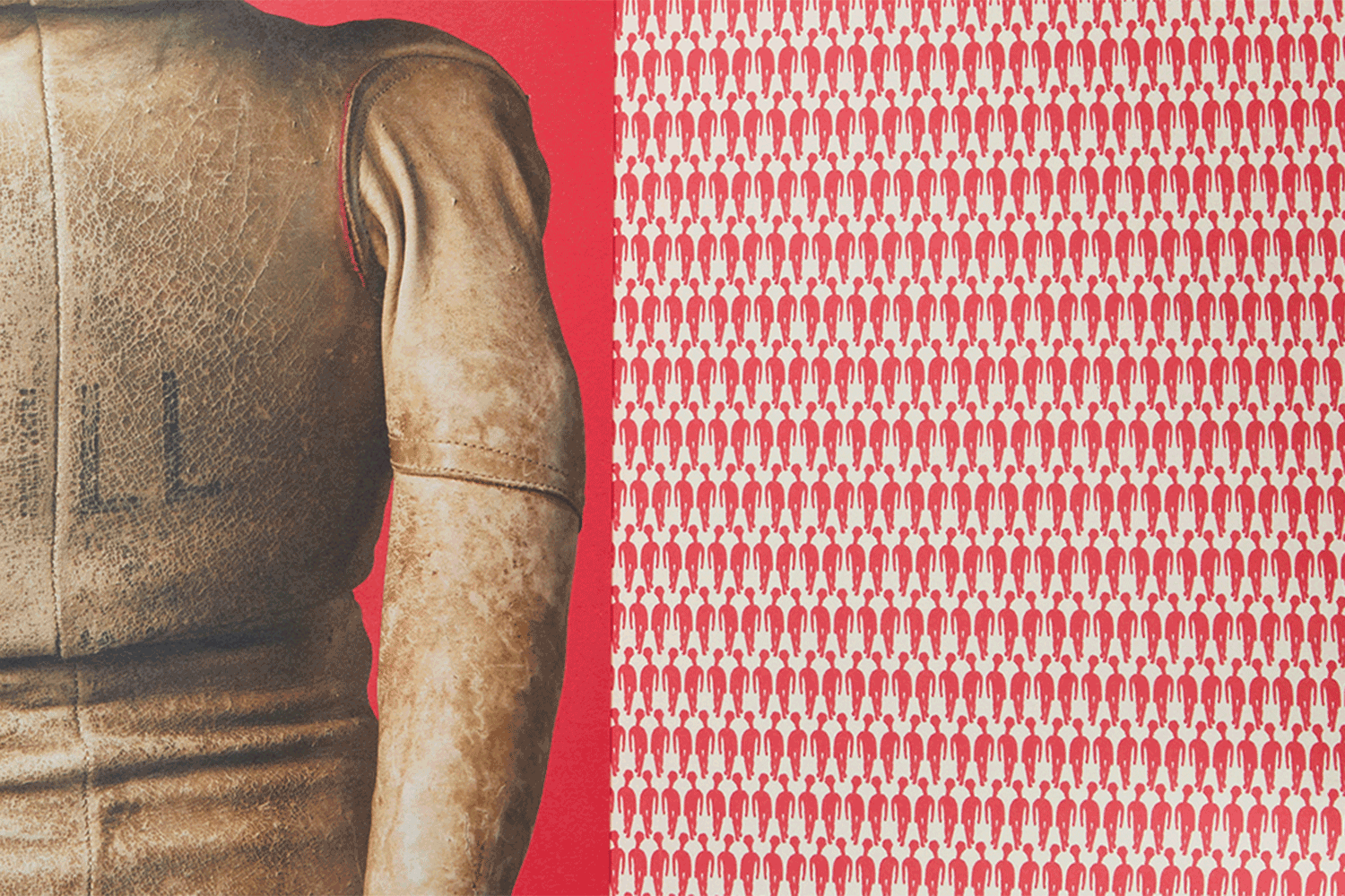
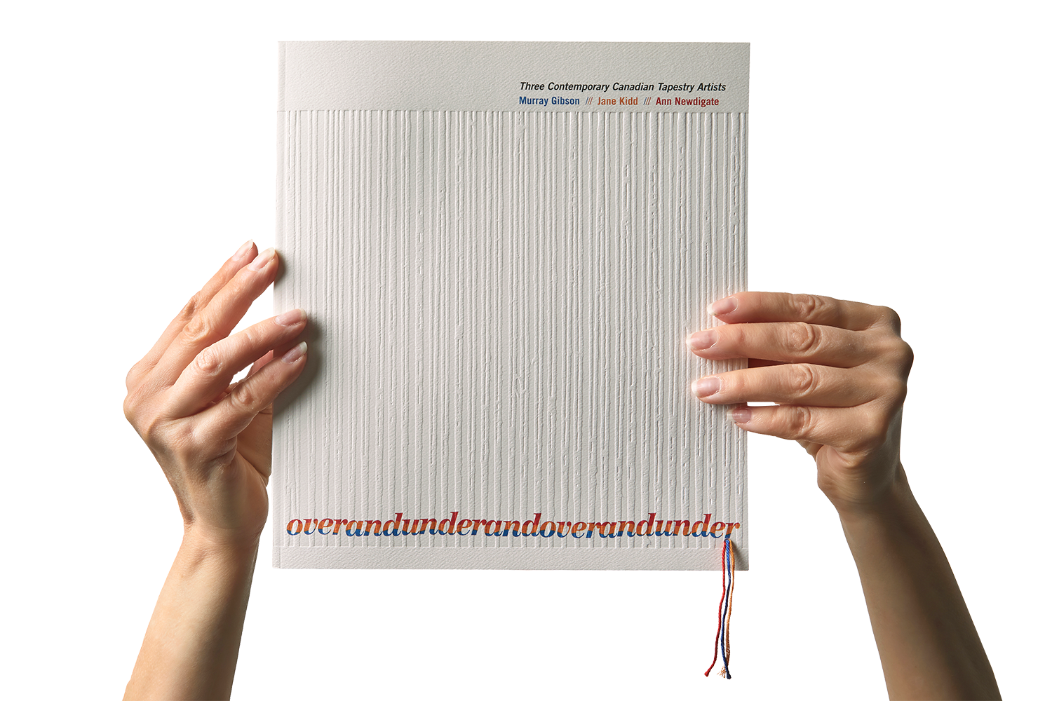
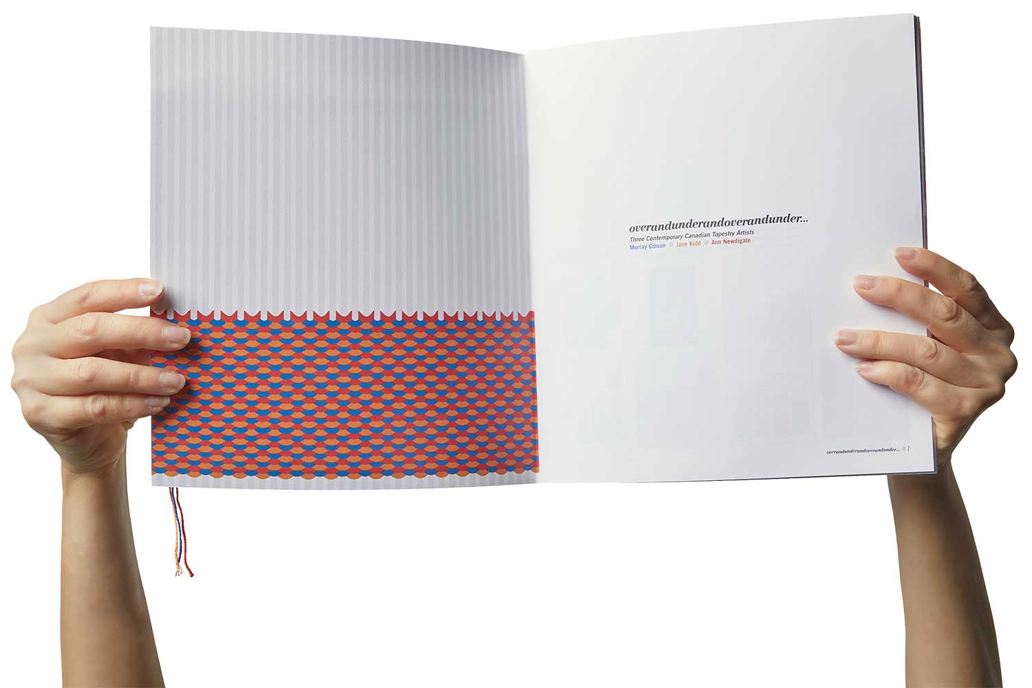
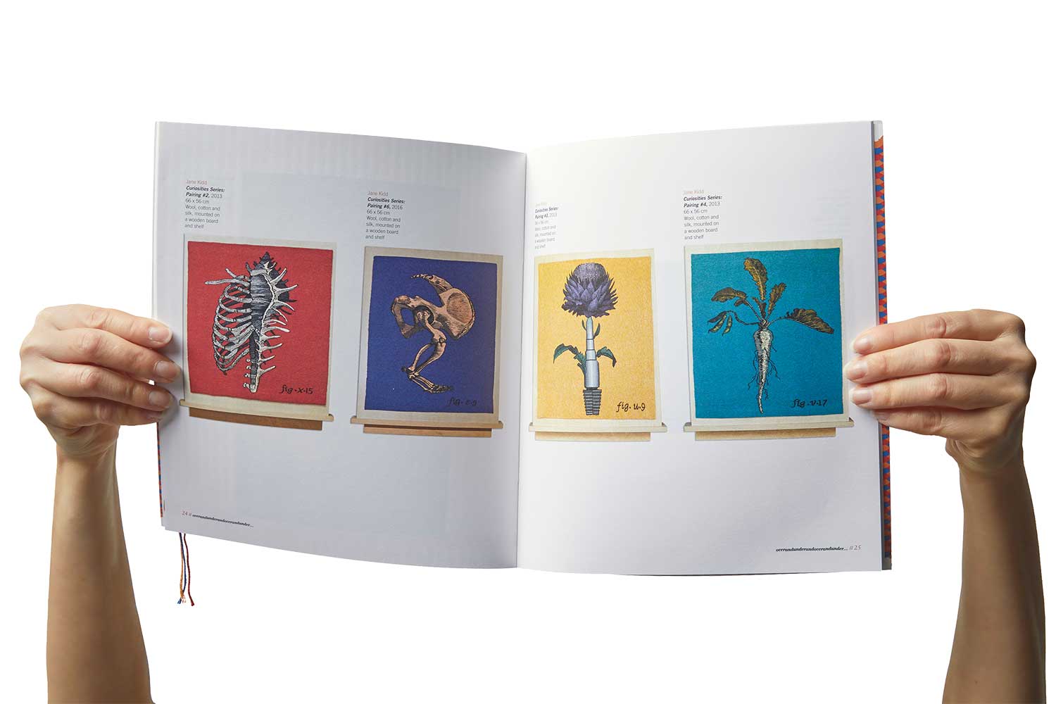
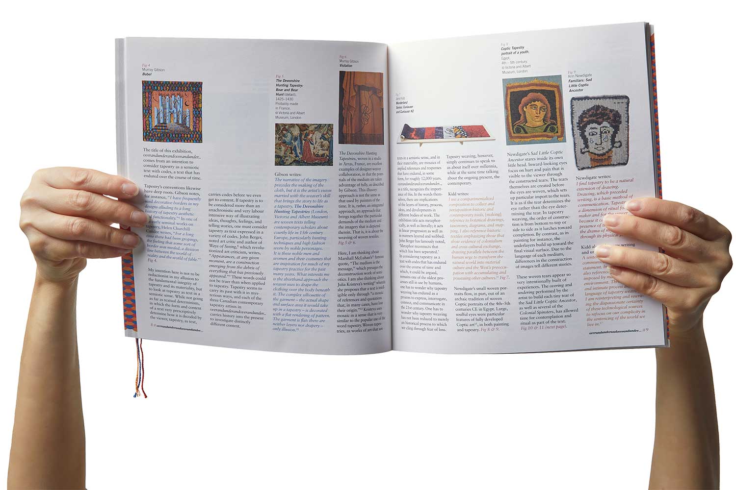
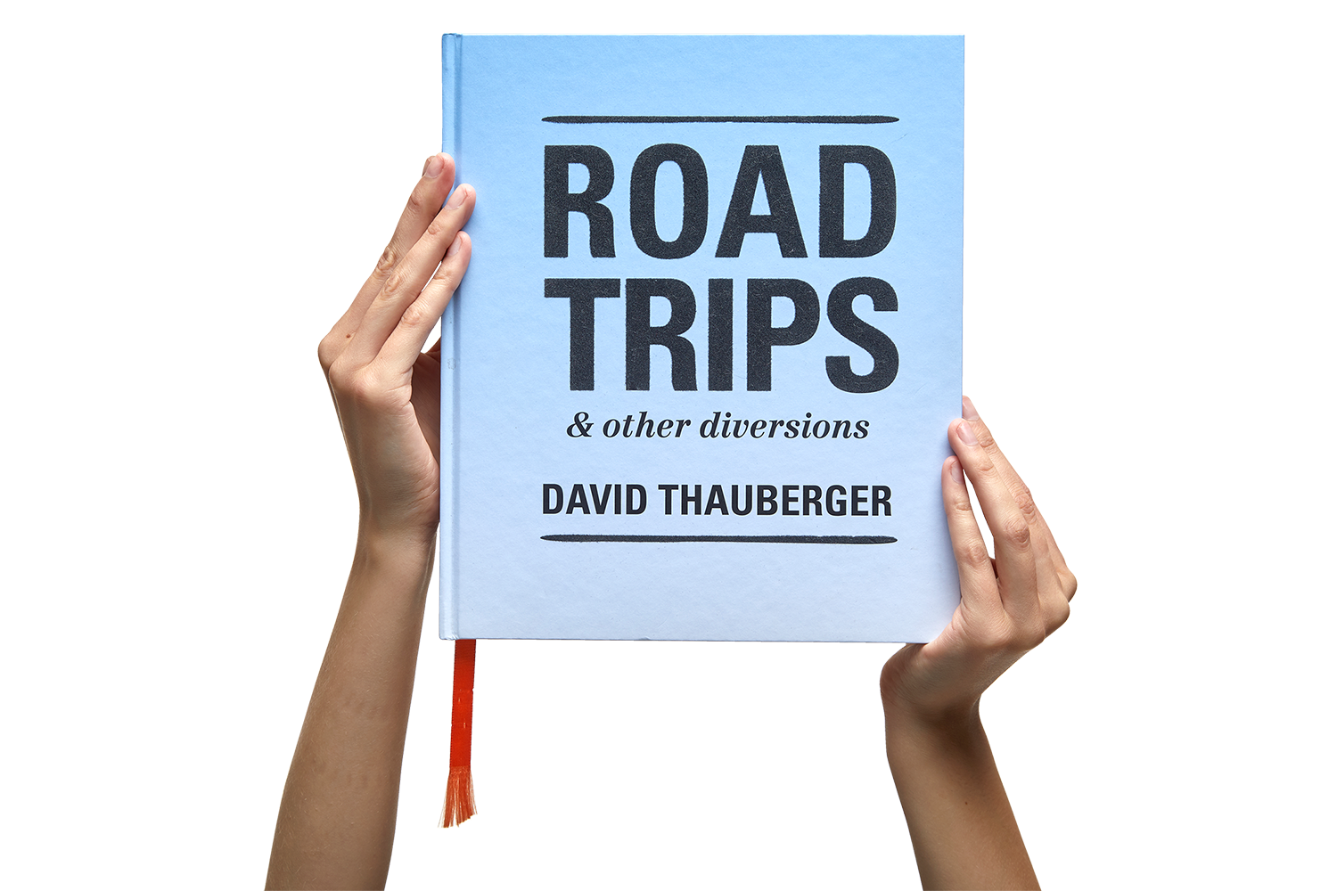
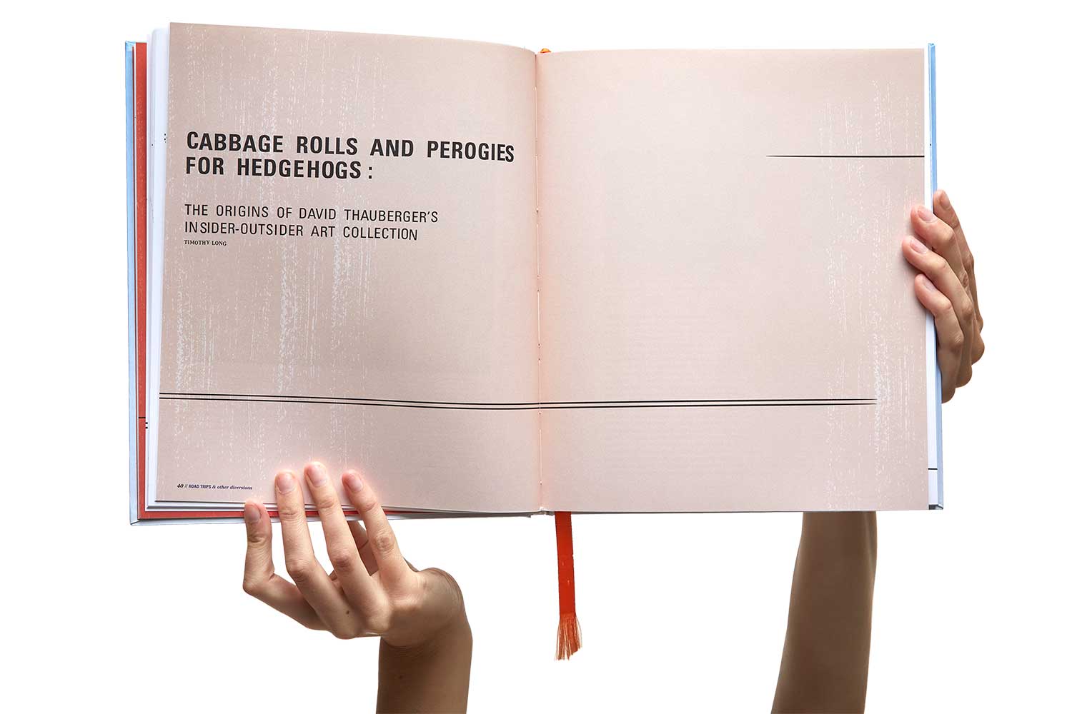
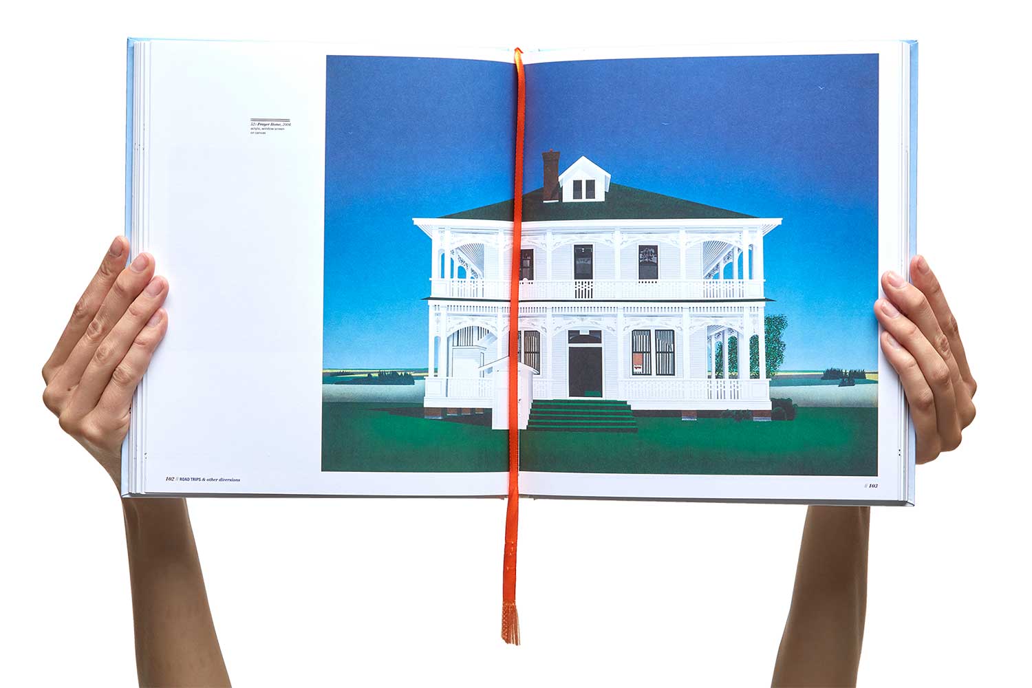
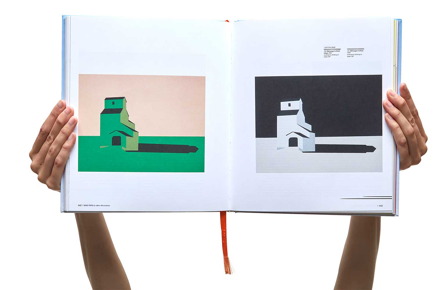
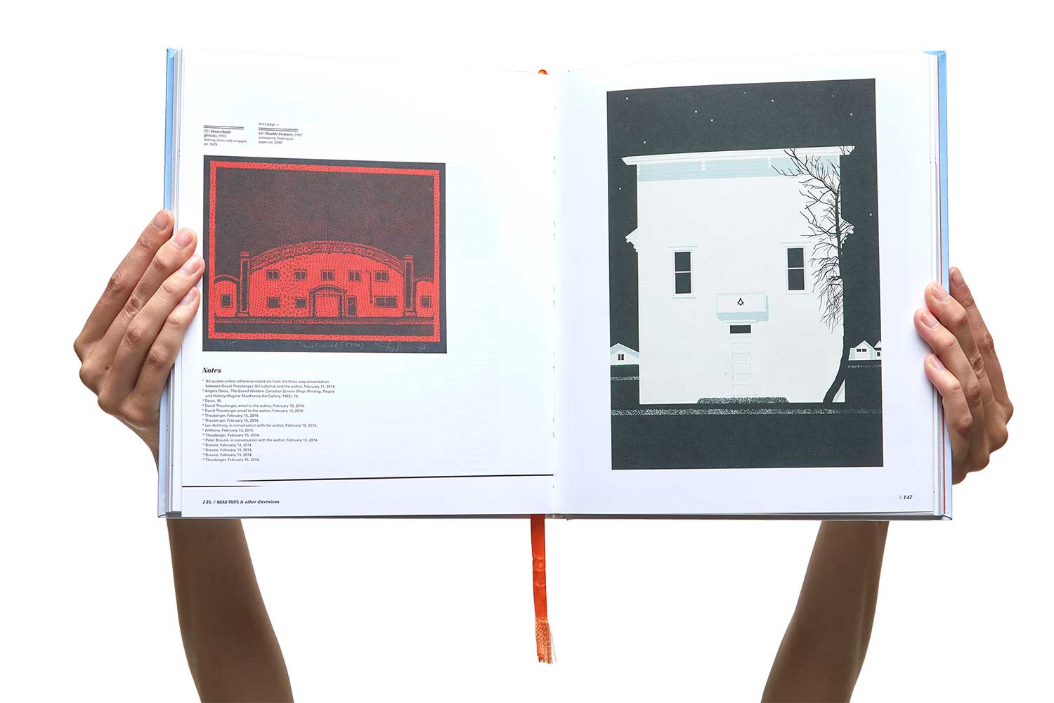
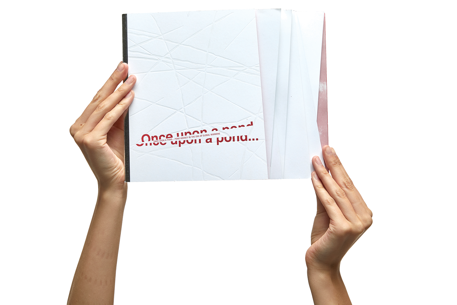
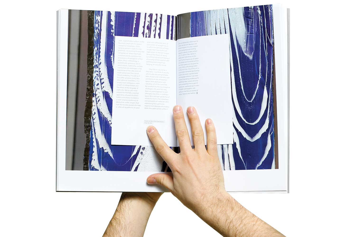
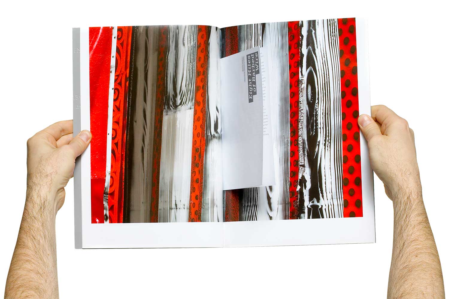
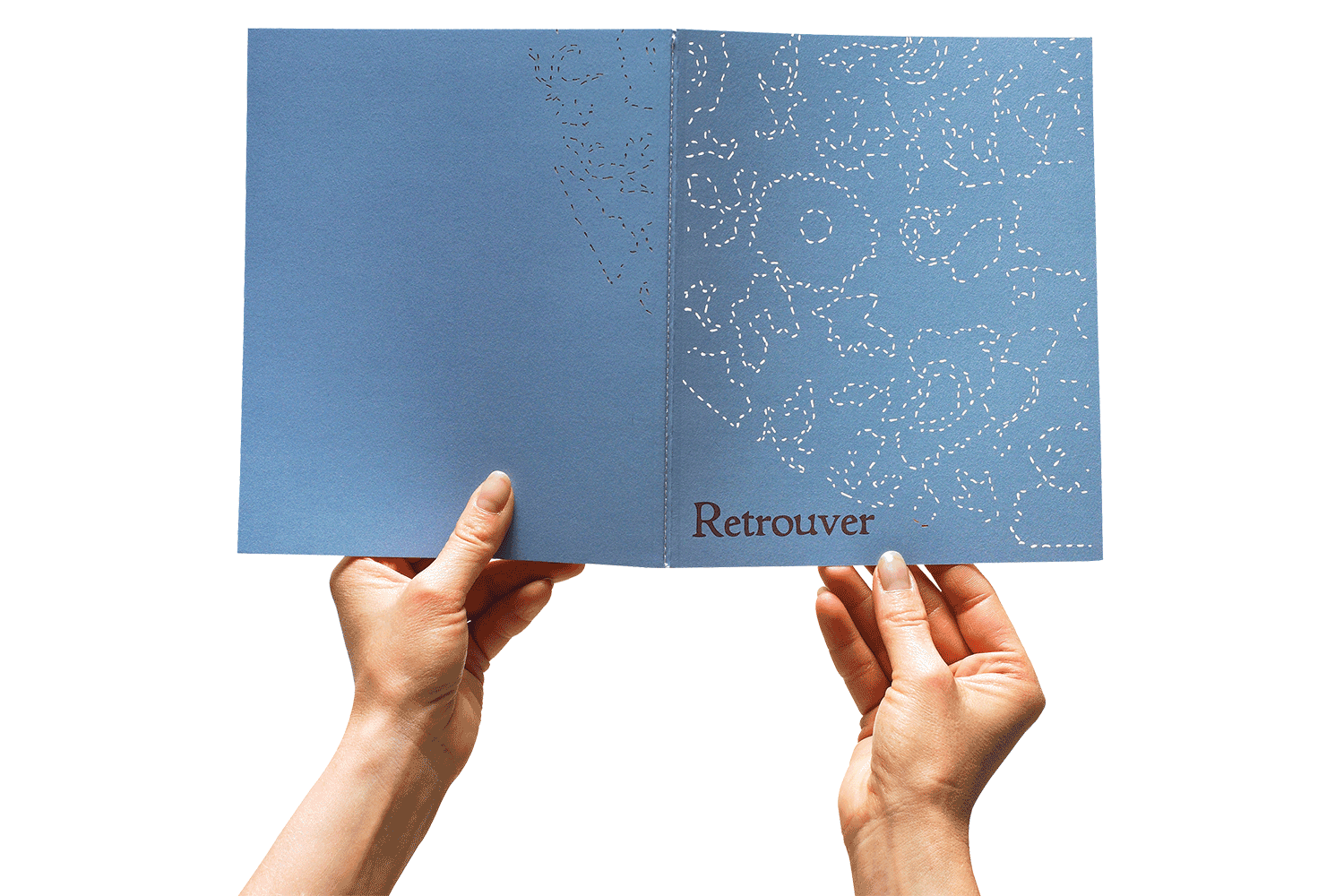
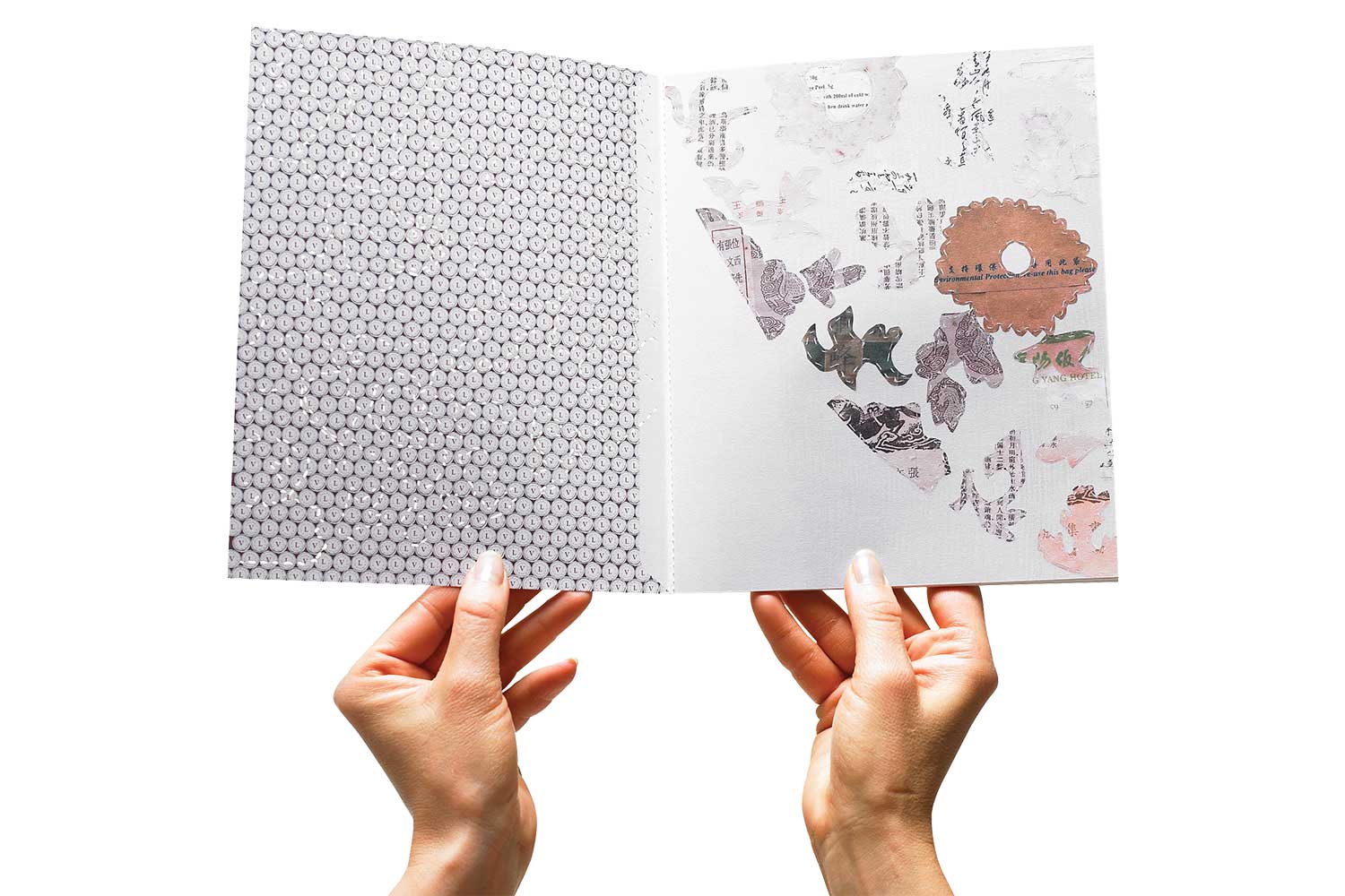
The strongest books communicate through every detail – from format, materials to pacing, typography, structure and physical interaction.
We create editorial experiences where content and form are inseparable. The result is a book that invites curiosity, encourages deeper engagement and stays with the reader long after the final page.
Every book or magazine is different, but our approach remains the same.
Discover. We believe content drives design. We explore every aspect of the material – from essays, interviews and biographies to photo essays, photography and supporting content –, to uncover the theme, relationships, and narrative threads that connect the publication to its readers.
Define. Once the story is clear, we shape the editorial concept. We determine how the publication should feel, how the content should be organized and what will sustain curiosity from the beginning to end.
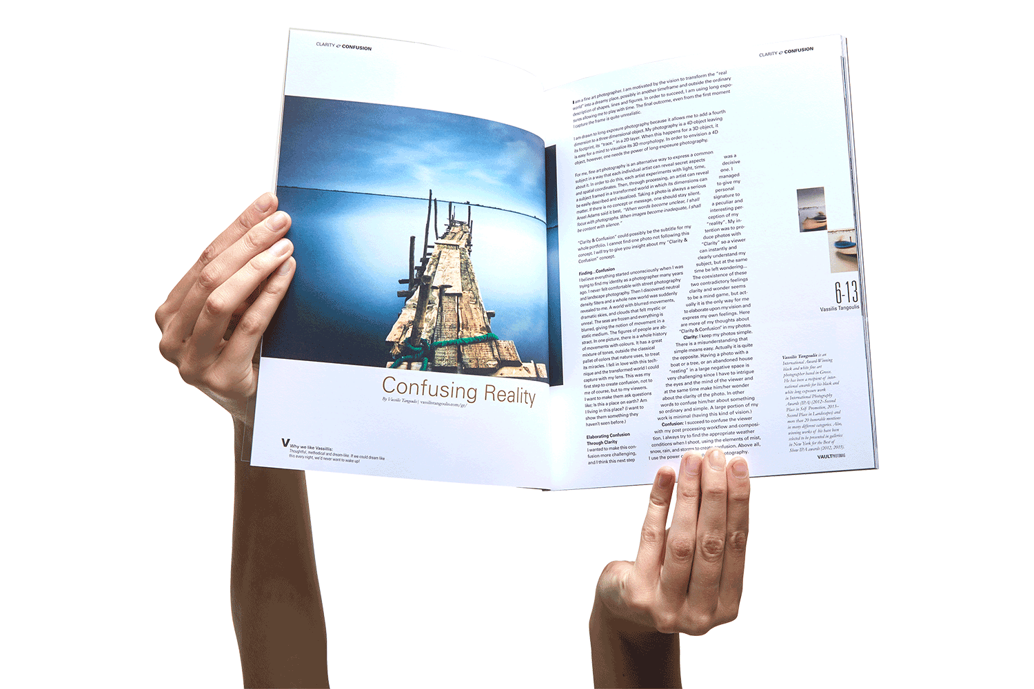
Design. With a clear direction, the publication becomes a physical experience. Typography, imagery, materials, sequencing and navigation all work together to create something that is purposeful, intuitive, and true to the content.
MAGAZINE >>
PROJECT TYPE
Brand, Brand Story,
Editorial, Magazine,
Content Creation,
Art Direction
A magazine that questions what it means to be a magazine.
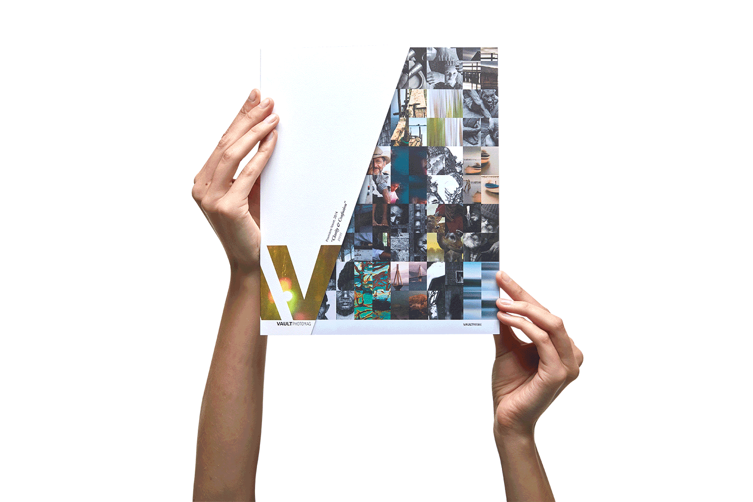
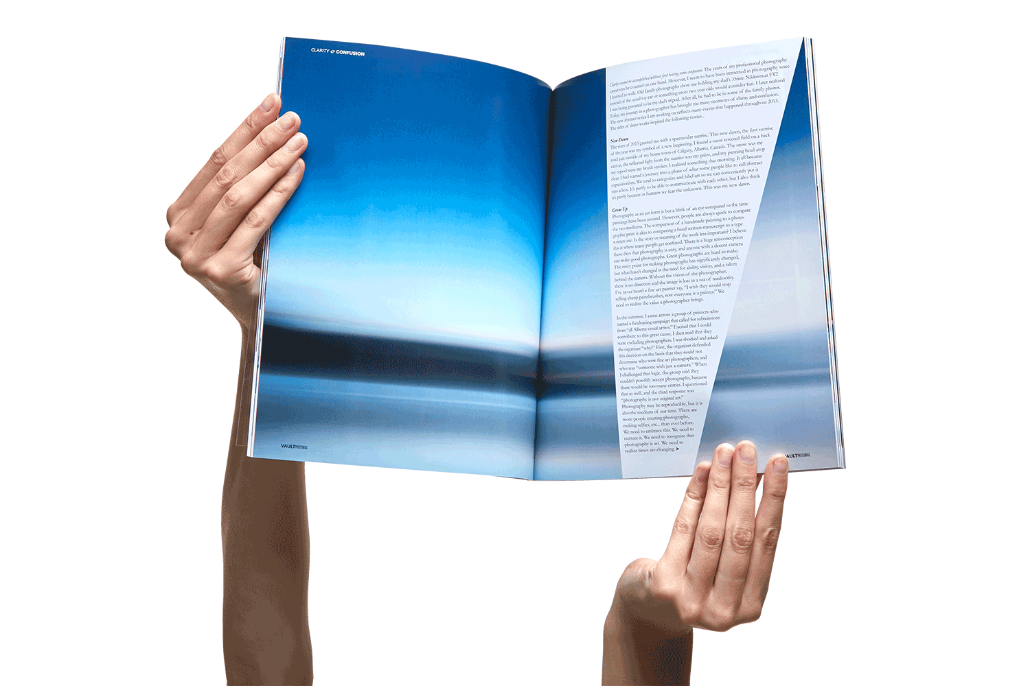
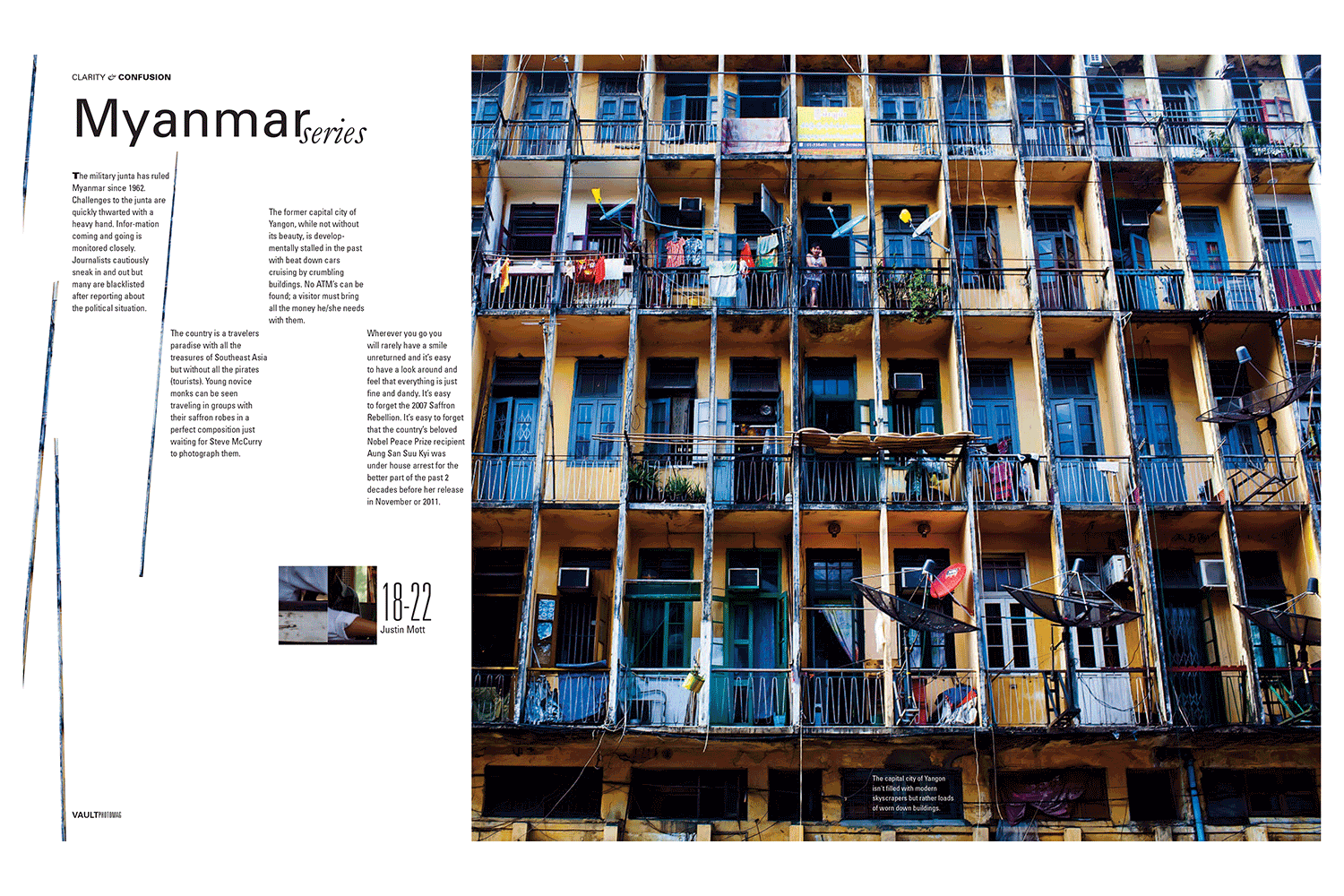
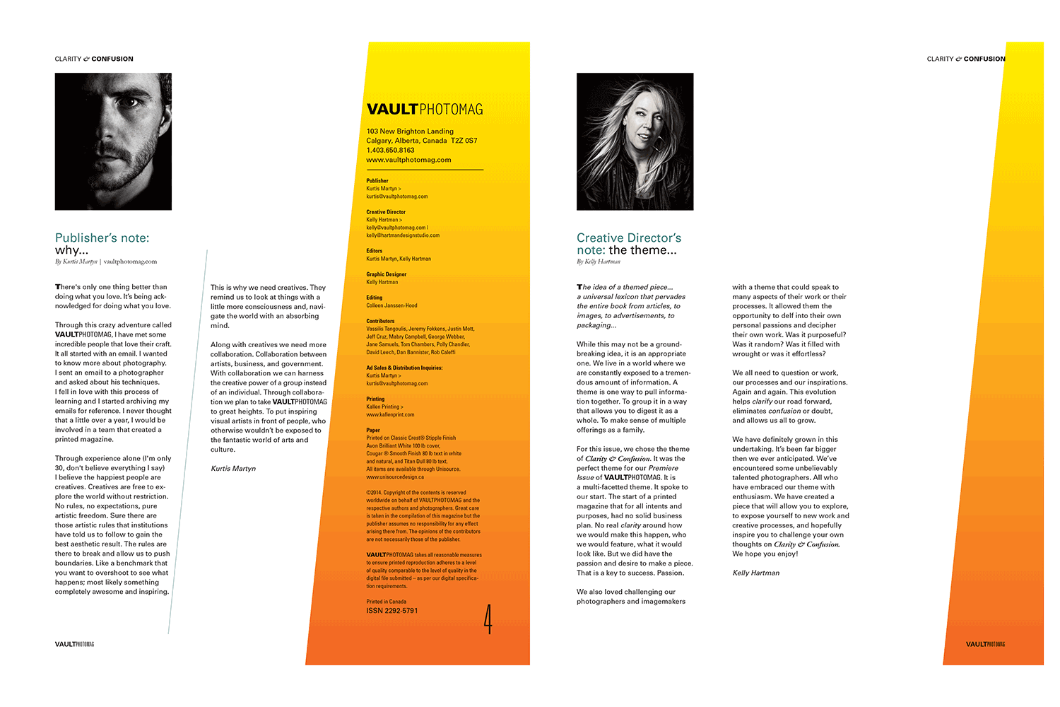
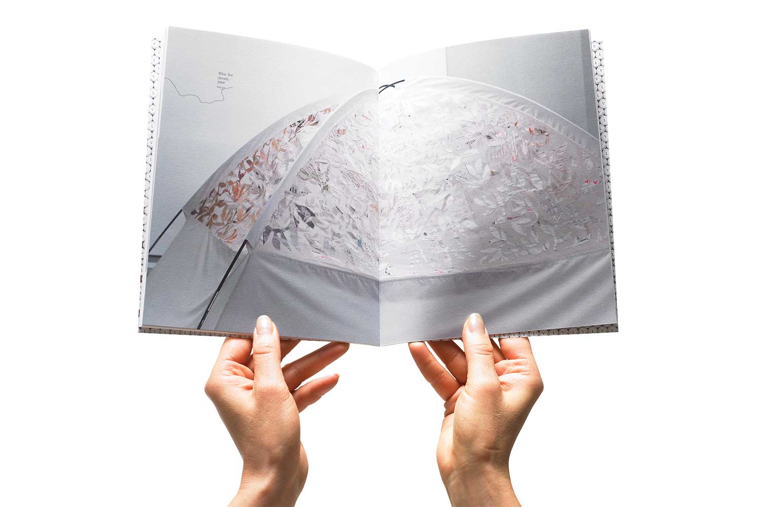
VAULT PHOTO MAGAZINE A limited edition magazine based on the theme of “Clarity and Confusion”. The story pays homage to a curated group of photographers whose non-commercial work stands out, pushes the boundaries of the craft and somehow spoke to the theme either literally or conceptually. The theme became the common thread between the photographers work and the design.
HDS was responsible for brand concepts and story, content creation, design, and execution of the magazine along with all promotional materials and event support.
A different lens.
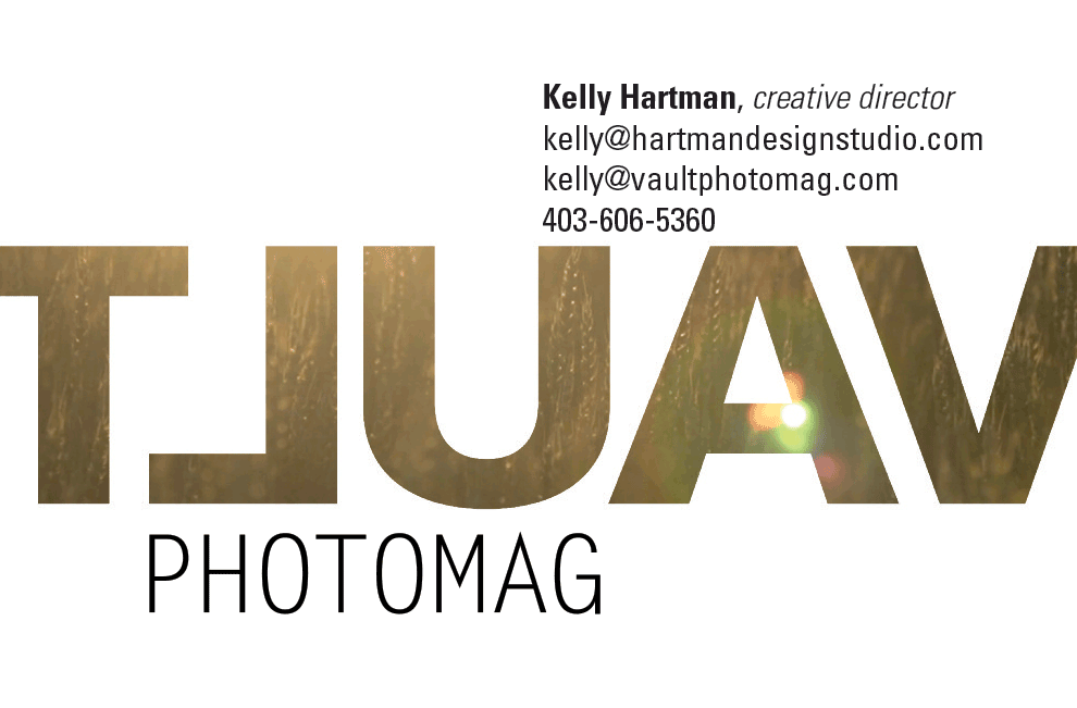
A traditional masthead was not only cast in reverse (like the lens of a camera) but barely graced the front – instead wrapping itself around the back in defiance.
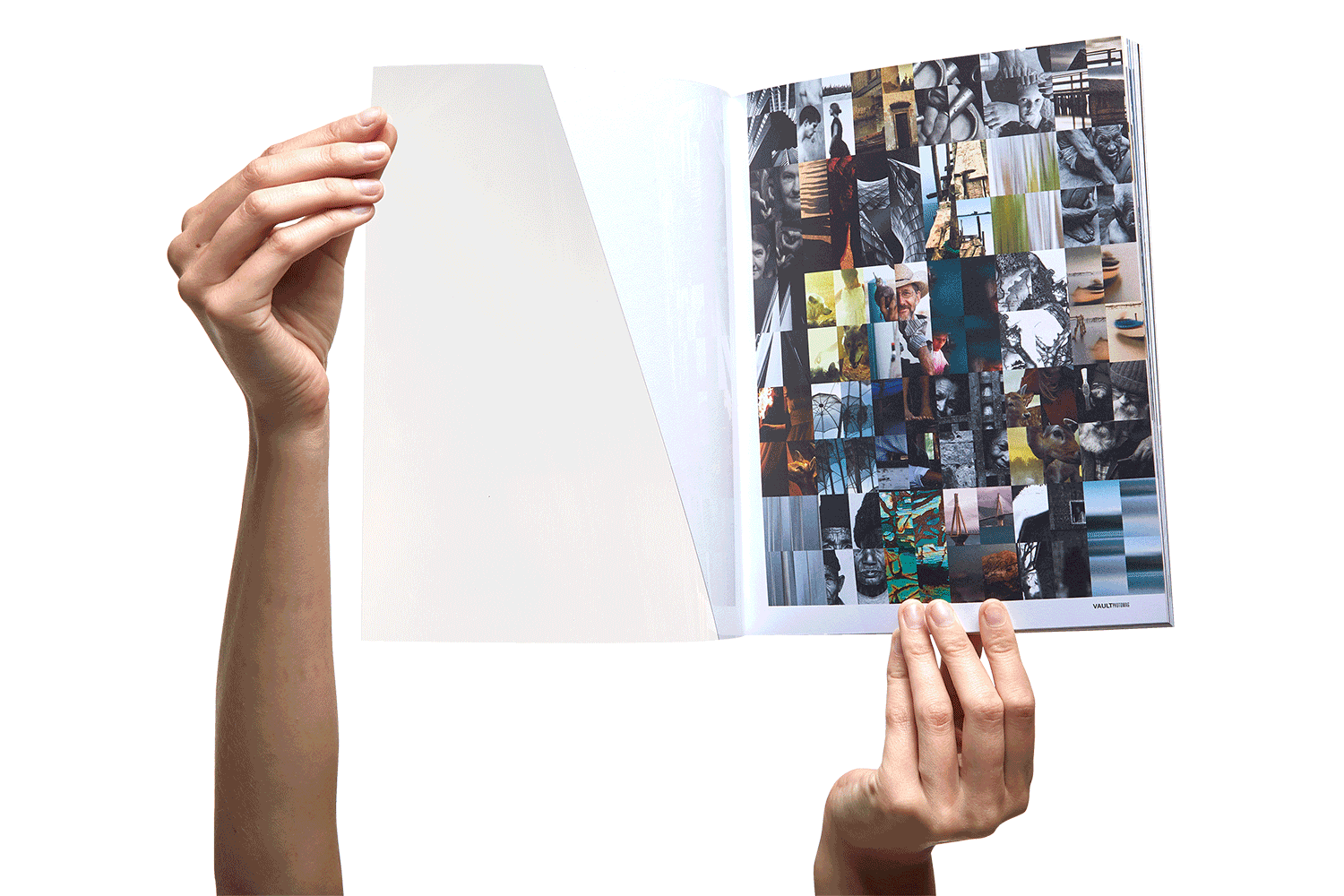
A clear acetate cover allowed the first page to show through so what was the second page became the cover. A challenge on what it means to be a cover. Each thumbnail image on the “cover’ represented one of the photographers and its position was repeated in the respective section creating an unsual table of contents and naviation cue for the reader.
Typography, structure and grid mimicked the “V” while constantly interacting with image and essays.
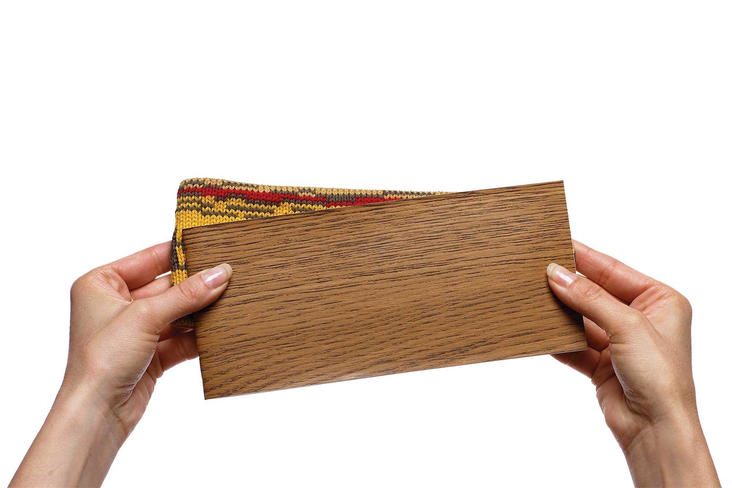
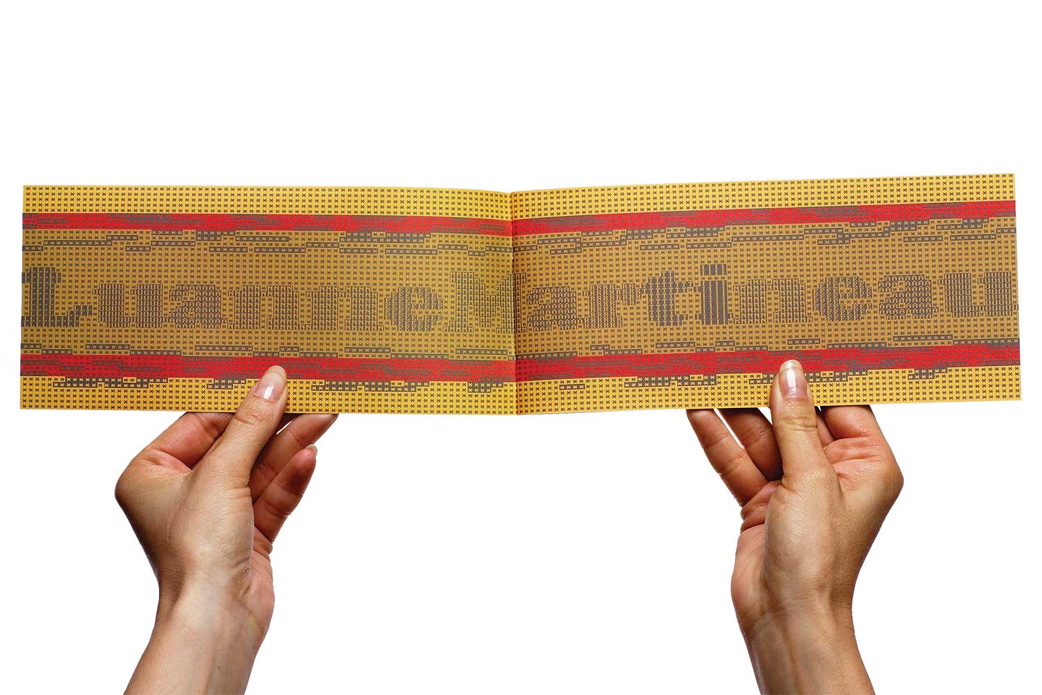
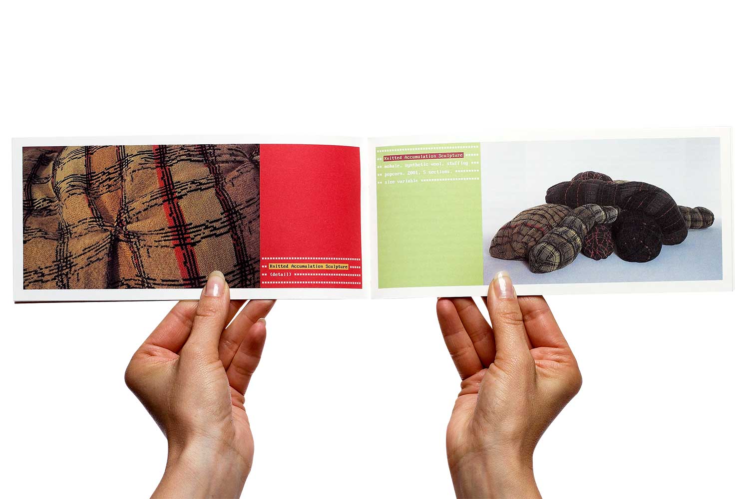
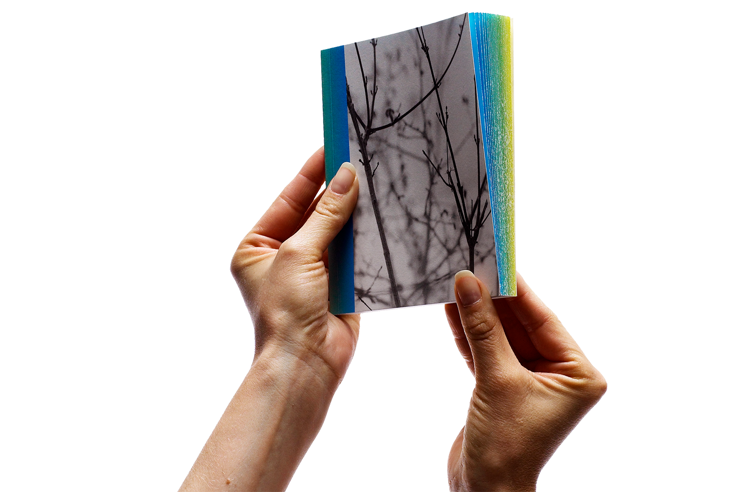
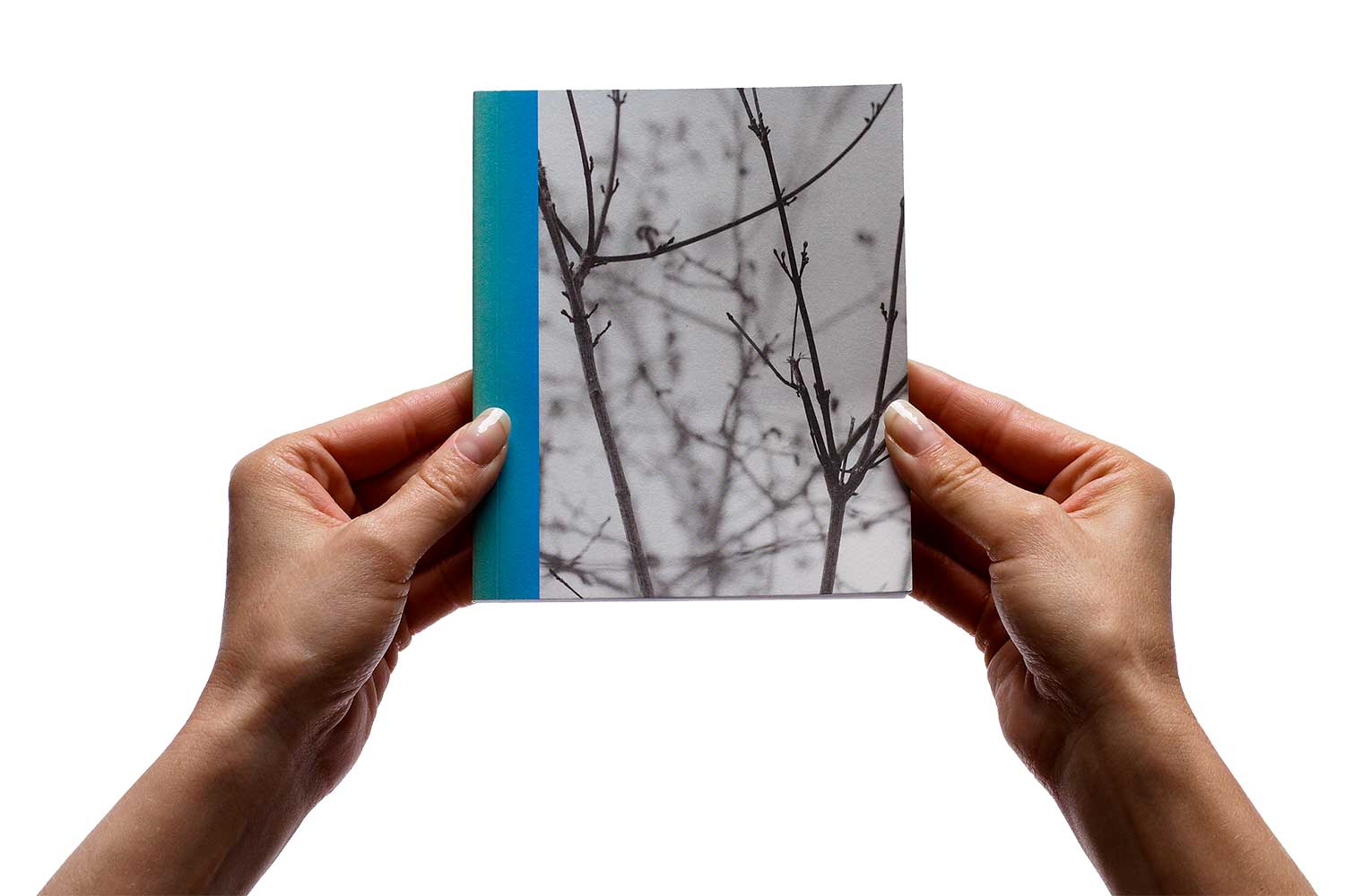
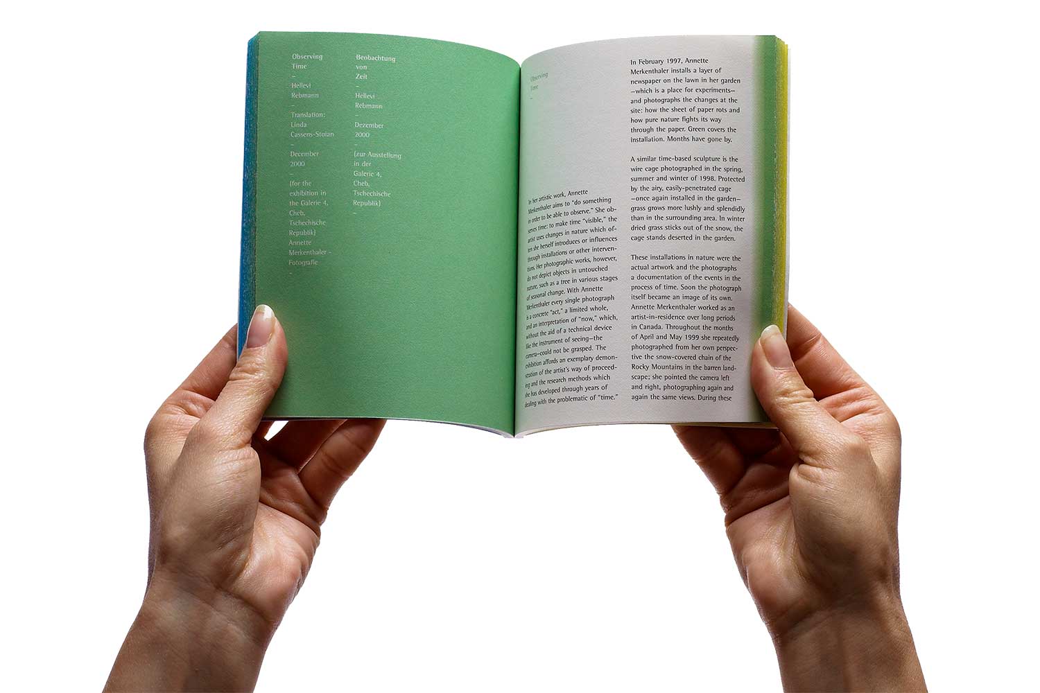
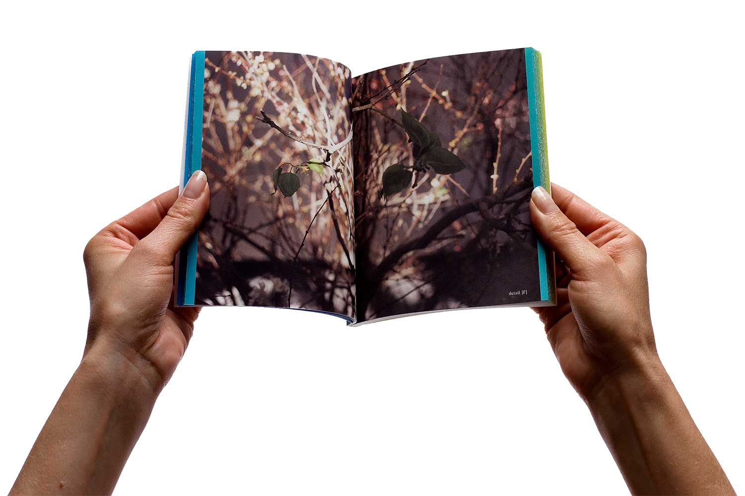
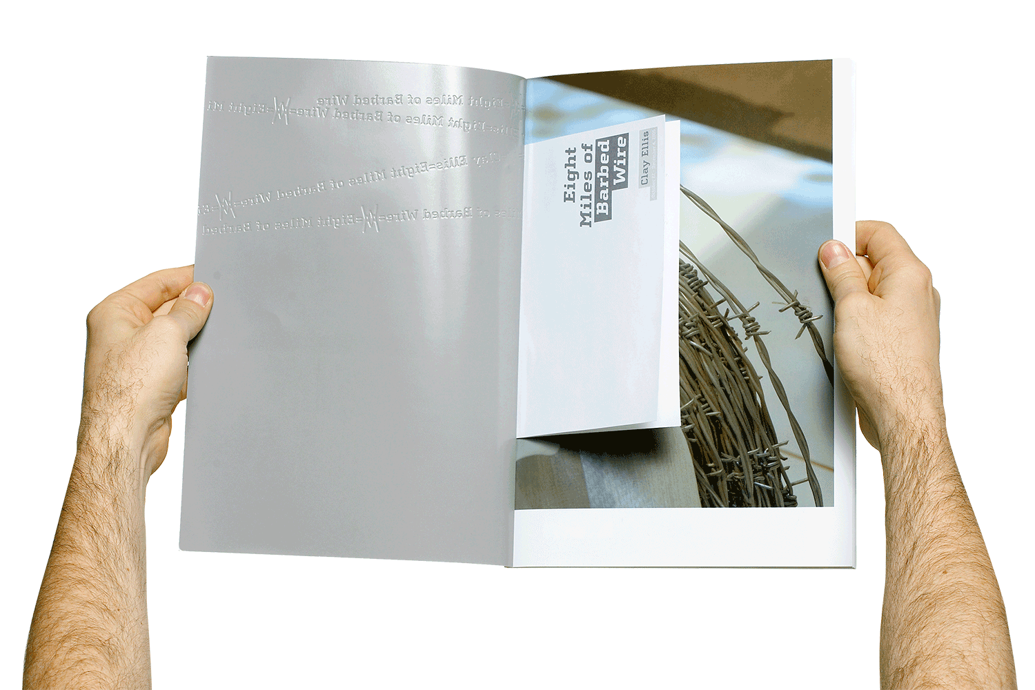
More Editorial Work



WHAT OUR CLIENTS HAVE TO SAY!
“Kelly Hartman (Hartman Design Studio Inc) was instrumental in strategically rebranding Hoffman Institute Canada. She was able to clarify who we were, what made us unique, and how we could tell our story in a clear, informative and meaningful way. The brand was repositioned so all elements not only resonated with our past clients but helped open the door to many new clients. It was approachable, accessible and very appropriate.”
>> Darren Weeks, Owner, Hoffman Institute Canada