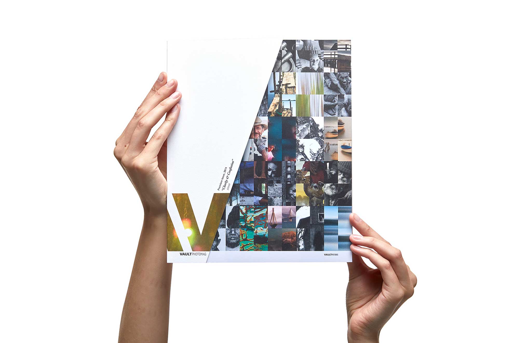
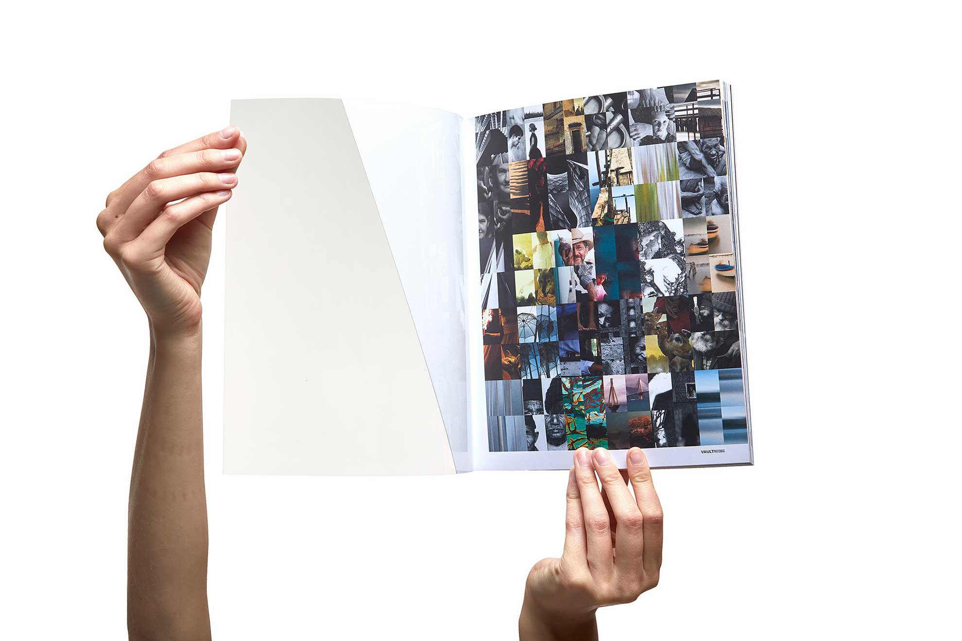
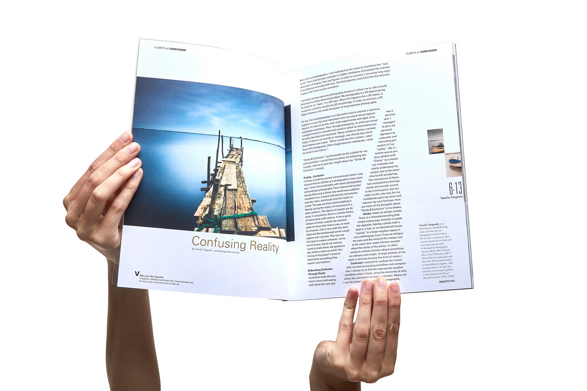
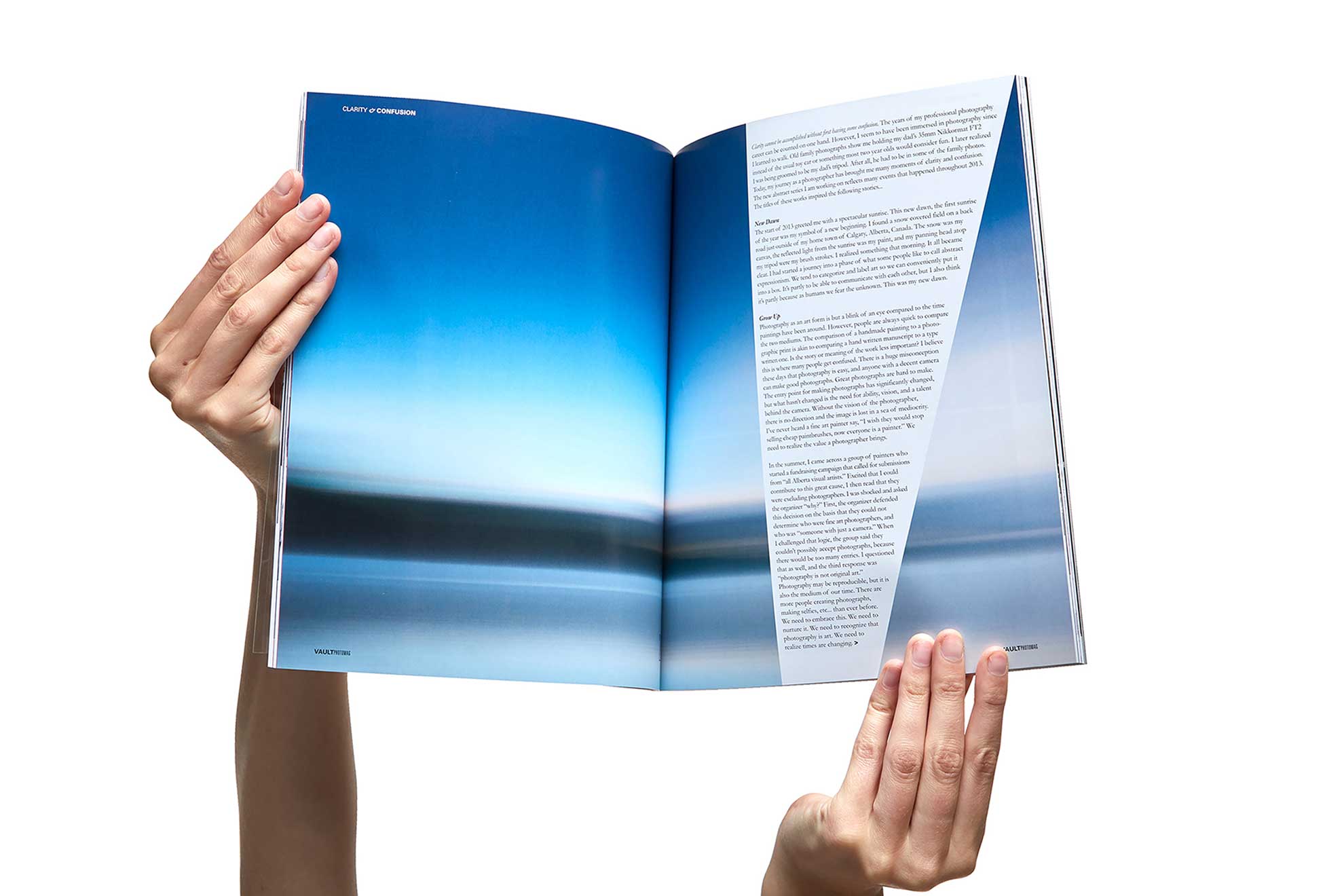
The theme became the common thread between the photographers work and the design. A traditional masthead was not only cast in reverse (like the lens of a camera) but barely graced the front. Instead wrapping itself around the back in defiance. A clear acetate cover allowed the first page to show through so what was second page became cover. Typography, structure and grid mimicked the “V” while constantly interacting with image and essays.


