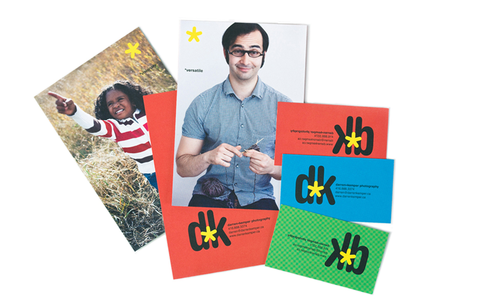
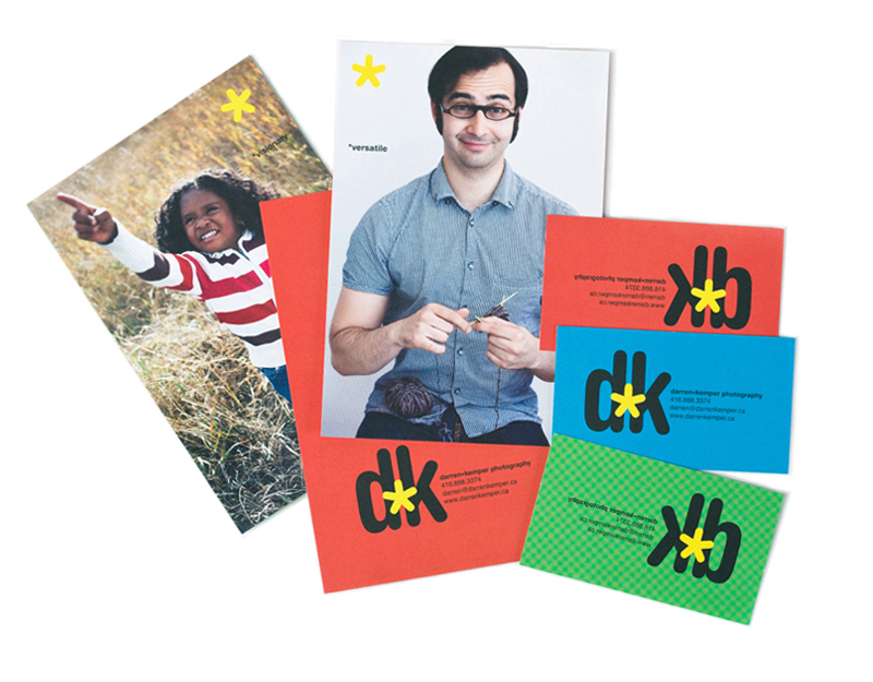
We created a series of three interchangeable business cards with a mark using his initials ‘d’ and ‘k’. The d appears forward and the k backward – mirroring the relationship of the photographer and subject. A catchy flash symbol linked the two initials together. The three cards only varied in colour: one in red, one in green and one in blue – which is the RGB colour space of digital photography and web.